Wednesday, December 19, 2012

Brief - Music Video


Brief

A brief is when you give instructions to someone or inform them, saying what they have to do for the task that has been set. A brief can either be written down or given verbally to whomever it is that needs the information.

It also gives the deadlines that are set so that they know when the work has to be handed in.  A brief is important because it is the only way that you can inform someone of what it is that you want from them and when.

With a music video a brief could be the times that you need the band or artist for filming and what the storyline is going to be so that they know what is going on in their music video, as after all it is a video that is being produced for them.

The brief does have to follow some laws so that they don’t exploit the band or the artist that has put trust in you. In the brief you would comment on anything inappropriate, in example if a racial comment or remark is in the video or even implied and the band didn’t know anything about it and it is offensive to them then they could sue the maker.

 Also anything incriminating in the video could give the band a bad reputation that they might not have wanted. One opportunity that a brief could present is any of the idea the band have that they can bring forward so that they can have a say in what is in the video. It also helps in organising everyone so that cast and crew know what it is that they are doing and when.

Wednesday, December 12, 2012

Music Vidoe Refferences

Renegade

The Video
http://www.youtube.com/watch?v=W1ZY6va3tuI

Live Videos used in the actual video
http://www.youtube.com/watch?v=ws29mQ5DMXE
http://www.youtube.com/watch?v=BUtRu1fFaE0
http://www.youtube.com/watch?v=0O9V8N6VDW0
http://www.youtube.com/watch?v=5diTmobwQYs
http://www.youtube.com/watch?v=sa-TLEooZiM

Where the information was found
http://www.paramore.net/splash
http://en.wikipedia.org/wiki/Paramore


Skillet

The video
http://www.youtube.com/watch?v=1mjlM_RnsVE

Behind the scenes
http://www.youtube.com/watch?v=loGA3tSusQg
http://www.youtube.com/watch?v=aJT9CQtAG8s

Where the information was found
http://www.skillet.com/
http://en.wikipedia.org/wiki/Skillet_(band)


We need to have all this information as it can prove to whoever is looking at the work that we did look for the information and also if we needed to look again to change anything then having all the links to help us find all the information we used again. When we were having to find out all about the band and there history we needed to be able to access the information easy so that we could talk about them, without this information there would probably no history to the band in our presentation
It dose also back up any sort of references that we make so that we cannot be accused of making up any information. The only problem with finding the information is that it can be hard to find some information as there isn't always something on the Internet, but overall i am glad that it is so easy to find out the information that i need with very little difficulty and that i am able to show where it is i got the information.

Multi camera

Not Going Out - S3 E2
  • Looks like it could be single camera but a chance that its not. If so there are about 3 cameras
  • I think its filmed over one day at the most 2
  • There is an audience

Weakest Link
  • It is multi camera. I think that there are about 6 cameras
  • There is and audience as you can see them in the back
  • It is done in one day
Jeremy Kyle
  • Definatly multi camera
  • One day filmed
  • definatly an audience
  • around 6 cameras or more

Monday, November 12, 2012

Music video - start living

Meaning – whats it about
Its about beeing cheated on and not wasting your time on greaving over the perfon who has betrayed you and going out and starting to get your life back being single.

 What meaning you want to create (1)

Content – what is featured in the song
We will want to show that the singer feels betrayed by her ex as she didnt know when it was he started cheeting, also we would want to show that she is over him and no longer cares for him and is more than redy to move on

what will be featured - emotions (3)

Imagery – what could the video be
See that band playing towards the camera. A woman finding out that her partner is cheeting on her. Could walk in and see it, see texts, be suspicious or find items to that give implications of the man beeing unfaithful.

Narrative - story
We will show the singer finding out about her partner cheeting, but we will also have to show times before she found out showing how happy they seamed together and we will have to imply that he is sneaking off to sleep with another woman. We will have to show this without it beeing seen as pornoghraphic.
and we will make sure that what we film works with the lyrics while trying to portray how she is feeling

how you gonna create it mofo (2)

Duration - 3:29


Pace – upbeat and fast


Style punk/rock


Semiotics -
 Burning letters/photos, deleting texts, breaking stuff (all for anger)
Out with friends, smiling, flirting, avoiding him (Relief)

Thursday, October 11, 2012

Music video

6-8 posts showing research include
-Video Clips
- Still Images
- Quotes
- Statistics
Each post should also have notes on your reasons for including it. And what you have learnt from the research  Each post should include the different purposes of the videos.

  1. Green Day-21 Guns
  2. Avril Lavign-Wish you were here
  3. Bruno Mars-It will Rain
  4. Will.I.Am-Feel the Love
  5. Rihanna-We foung love 
  6. Professor Green-Read all about it 
  7. Christina Perri-Jar of harts
  8. LMFAO-Party rock anthem
  9. PSY-Ganmnem style
  10. Dappy-Good Intentions


Green Day 21 Guns


Brief History

-It was released as the second single from their eighth album, 21st Century Breakdown.
-The single was released on May 25, 2009 as a digital download and July 14, 2009 as a CD single.
-It was nominated for a Grammy for Best Rock Performance by a Duo/Group with Vocals and Best Rock   Song in 2010.
-21 Guns has sold over 2,151,000 copies as of December 2011
- Filmed in Los Angeles on June 6, 2009

Narrative

-21 Guns addresses the topic of patriotism.
-"It brings up 21st Century Breakdown in a lot of ways, and the 21 gun-salute for someone that's fallen" so said Billie Joe to Q magazine.
- They make the characters seem like they are the ones from the album cover.
- Its mainly about giving in but not surendering and finding someone amounst caose

Promotinal Tool

By posting comments on there own website and the behind the scenes.

Synergy

The song was used in one scene in Transformemers 2 in the beggining 
Fan reaction
65,934,392 views on YouTube with likes, 5,048 dislikes

Avalibility

YouTube
CD
I-Tunes


http://en.wikipedia.org/wiki/21_Guns_(song)


Avril Lavigne - Wish you were here


Brief History

"Wish You Were Here" was written by Lavigne, Max Martin, and Shellback

Even before being released as a single, the song peaked at number 99 on the Billbored Hot 100 and at number 64 on the Canadian Hot 100 on the week of the album's release


The song has sold over 500,000 units of digital copies in the USA. It was never released on radio in UK, Germany and some European countries.


Narrative
The song is all about Avril's divorce and how she wishes that he was still with her and that they had never parted. It is also about how to the world she is a strong and independent woman but with him she shows her vulnerable side and that her ex husband is the only person that she let down her defensive side.

Promotional tool

By posting comments on the social networking sites Facebook and twitter then latter on uploading pictures from the music video itself along with comments on the video about how all emotion shown is real.

Synergy

The song was performed live before release on the show Good Morning America

Fan reaction

likes, 17,245 dislikes

Jody Rosen, writing for Rolling Stones magazine, described "Wish You Were Here" as a "jangling power ballad".


While reviewing Goodbye Lullaby, Robert Copsey of Digital Spy concluded that the main theme of the song was based on the lines "I can be tough, I can be strong/ But with you it's not like that at all" and talked about Lavigne's divorce. He further put the song in his list of "Possible future singles".


On a more negative note, Mikael Wood of Spin magazine wrote that, in songs like "Wish You Were Here" and "Everybody Hurts", the "former brat-punk princess in dreary woe-is-me mode" can be found. According to 


Jonathan Keefe of Slant Magazine, this song, along with others from Goodbye Lullaby, "mistake having a potty mouth for having an actual personality", stating it "fails to pass off 'Damn, damn, damn / What I'd do to have you here, here, here' as a hook".


A writer for the magazine Billbored simply called the video "dark"


Marina Galperina concluded "Unlike other recent videos 'What the Hell' and 'Smile,' this latest cut from the Goodbye Lullaby album is a bit somber."


 Critical reception towards the song was positive, with critics praising it as a highlight on the album.


Avalibility

YouTube
CD
I-Tunes
On her official Site


http://en.wikipedia.org/wiki/Wish_You_Were_Here_(Avril_Lavigne_song)


Bruno Mars - It Will Rain


Brief History

"It Will Rain" is a song by American artist Bruno Mars. The song was released on iTunes for purchase on September 27, 2011

An accompanying music video was planned to premiere on October 26, 2011 on MTV. However, on October 24, 2011 Mars announced over Twitter that the music video had been delayed. It was then latter on shown on November 10, 2011.


"It Will Rain" is a love ballad co-written and produced by Bruno Mars and his songwriting and production team, The Smeezingtons.


Narrative

The song and music video are about being madly in love with someone and not wanting them to ever leave otherwise it would break your heart and leave you in a depressive state.

The singer himself described the song as "think of the darker side of love". The agony and torment of heartbreak in the lyrics describe the universal emotional pain of relationship bonds like Oxycontin relationships, sexual arousal, bonding and romantic attachment and behavioral addiction, being ripped apart that results in depression.


Promotional Tool

Being used in a big film like the twilight saga as it is a fitting song to the film with few scenes of the film shown in the music video.

Synergy

The track appears on the soundtrack to the film The Twilight Saga: Breaking Dawn – Part 1.

Fan reaction

The music video has 123,512,974 on YouTube with   likes, 7,729 dislikes and comments like:
"What a voice"
"you make me cry when i hear this song"
"one of the few good artist out there"
"I LOVE this song its just the best song i ever heard from BRUNO MARS!!!!!!!:D"

While the live vershion that was on the USA X-Factor has  2,413,033 views wit likes, 184 dislikes and comments positive comments like:
"He is amazing!"
"He is a truly great singer"
"The Best Performance !!! I Lovet" 
"♥ u bruno mars !!BEST SINGER !!BEST LIVE PERFORMENCE !!BEST SONG !!"  

This song around the world did very well

Chart (2011-12)Peak
position
Australia (ARIA)14
Austria (Ö3 Austria Top 75)25
Belgium (Ultratop 50 Flanders)46
Belgium (Ultratip Wallonia)9
Canada (Canadian Hot 100)5
Denmark (Tracklisten)11
Netherlands (Mega Single Top 100)56
Finland (Suomen virallinen lista)15
France (SNEP)58
Germany (Media Control AG)14
Hungary (Rádiós Top 40)28
Ireland (IRMA)11
Israel (Media Forest)8
New Zealand (RIANZ)2
Poland (ZPAV)3
Romania (Romanian Top 100)21
Scotland (Official Charts)15
South Korea (GAON)2
Spain (PROMUSICAE)43
Sweden (Sverigetopplistan)48
Switzerland (Schweizer Hitparade)22
UK Singles 14
US Billboard Hot 1003
US Pop Songs 1
US Adult Pop Songs 3
US Adult Contemporary11
US Hot R&B/Hip-Hop Songs83
Venezuela Pop/Rock General 1

Availability 
YouTube
CD
I-Tunes

http://en.wikipedia.org/wiki/It_Will_Rain


Christina Perri - Jar of Hearts


Brief History
"Jar of Hearts" is the debut single by American singer-songwriter Christina Perri. The song was released onto iTunes July 27, 2010The song was written by Christina Perri, Drew Lawrence, and Barrett Yeretsian. Perri's inspiration for this song was from a real-life experience she have with a past love interest who wanted to recreate a broken relationship.

The song sold a total of 47,500 downloads in its opening week. The song has sold over 3 million digital copies in the US

Narrative
The song is about a broken relation ship and the man trying to fix it to be with her while she can no longer be with him as she herself would live to regret it. The man uses women that is where the line "collecting you're jar of hearts" comes from. In the video it is a dull colored and feels very dark in the way it is performed and in the video itself. It has a balletic feel to it as well and you can see that all the dancers in the background are also the women you see being used by the man. You can see that all the women are trying to fight him off at the end as if to show Perri's feelings towards the man as she no longer wants him in her life and then it as if she has won and is free from the man and so is her heart as he had control over her.

Promotional Tool
The song was premiered on the show so you think you can dance as her friend showed the song to a choreographer on the show and the woman liked it and created a dance to she song and asked Perri to play the song live on the show when the dance was performed.

Synergy

It was used for a dance in the show So you think you can dance

Fan reaction

On YouTube the song has 82,139,767 with  likes, 6,206 dislikes.

Kyle Anderson of MTV News positively reviewed the song as a "hook-heavy ballad,"
The  entertainment website Contactmusic.com said that the song is a "raw, defiant break-up song."
The song was in many charts in both the US and Canada at numbers 17 and 21 respectively.


Availability 
YouTube
CD
I-Tunes

http://en.wikipedia.org/wiki/Jar_of_Hearts


PSY - Gangnam Style


Brief History

It is about lifestyle in the Gangnam District and how most people in this area show class in there style and are know to be more stylish and "hip".

The music was composed by PSY and Yoo Gun-hyung who is a producer from South Korea. He has collaborated with PSY before Gangnam Style. Yoo was the one who song, while PSY were responsible for writing the lyrics to the song.

The song itself is making fun of the people that are from Gangnam who are saying that they are better and that are trying o be something that they are not.

The whole video was filmed in only 48 hours with only two of the shots actually being filmed in the Gangnam District

Narrative
The song is about "the perfect girlfriend who knows when to be refined and when to get wild."
It is also about the way that some people in the Gangnam District believe they are above other and it pokes fun at them for it with the comical dance that is used throughout the video until he find a woman who is perfect to the singer and she joins in with the dance showing her "Wild Side"

Promotional Tool
In the video the ginger female is a famous singer in Korea also they use members of a group from Korea

Synergy


Fan reaction

On YouTube it has 430,165,701 views with  likes, 182,075 dislikes
This song and video have done really well with a lot of people imitating the dance as it is dance challenge


Availability 

YouTube
I-Tunes
Digital Download


Dappy - Good Intentions 


Brief History
"Good Intentions" is the fourth official single to be released from British grime rapper Dappy's debut solo studio albumBad Intentions.

It was filmed about 8-9 times as you see that there is 2 of himself in the shot either in the background, walking away or towards the camera.


Narrative
The song is about his flaws and that he wants to better himself. In the video you see him walking though a ruined path almost like it is representing his life so far with certain items on fire like a piano and trees.


Promotional Tool

The song was commented on in Star magazine and there were comments on dappy himself as the song shocked many people as it is a strange song for this man and it also shows that he has a very good voice.

Synergy


Fan reaction

On YouTube it has 2,414,691 with  likes, 503 dislikes

Availability 
YouTube
CD
Digital Download
I-Tunes

http://en.wikipedia.org/wiki/Good_Intentions_(song)

Star Magazine


Monday, May 28, 2012

FX reaserch

Shows
NCIS
Dexter
American Dad
Family guy
The Clevland show
American horror story
Life
ReGenisis
Babylon 5
Burn notice
Falling skys
Life on mars USA
Aressted development
Leverage
Braquo
10 items or less
Better of Ted
Brotherhood
Eastbound and down
Final 24
Generation Kill
King of the hill
Nip/Tuck
No signal
Single dads
Testees
John from cincinati
The booth at the end
The border
The Defender
The Corner
The Listner
The path to 9/11
The Walking dead
True Blood
Under Belly
Urban Legends
http://fxuk.com/shows/list/past


Ownership and Funding
The TV chanel FX is owned by FOX a big Chanel and includes alot of big shows, FOX invest a lot of money into FX as they can aford to, The largest amount that they hav invested is around 4 millon dollers. They also get money from merchendise, the most simple one being DVDs of the shows. There is also poster clothes, key chains items from the shows, magnets, calenders and a lot more. This is one other way that they get money to help keep there shows going.
Fox are a big company that do own a few other companie and invest into them FX being one of them and probably the one they invest most into.


TV and Film industry work.

Fx
Reaserch company history - how its grown and developed
Discuss ownership of company - is it owned, is it a part of a group of companys, dose it own other companys?
How is it funded?
Discuss ist developmenty in technology e.g. Digital HD 3D etc

Tuesday, May 15, 2012

Video Installation

Bruce Charlsworth
http://www.brucecharlesworth.net/
Airlock
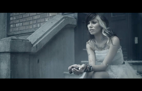
Airlock is in stages. You start of in one room looking at one of the videos and you slowly progress through the installation. It is very safe and people who are in the hallways can return at any given time if they were to start worrying.
From what i see the first room just has a T.V monitor showing a video, then you continue around the corner and down a shot hallway and there is a second video being projected onto one of the walls, with some normal household furniture at the end off the hall. Its seems from the floor plans quite safe and comforting. but in the actual instillation the walls are very close and there is very little room to move around and this can make some people feel claustrophobic especially when they continue fourth into the instillation. There is a very small room between the two main rooms that is roughly the size of an airlock and it has two doors to it, though i could only see through one of the doors as i could only see what was in the floor plans as there is no video to this instillation, the only video you see is the three that are in the building. Then you go thought the other door and you are in a larger room with a small swimming pool with another video being projected onto the wall. Compared to the other room this one is very dark as the hallway is light colours but they are very dull and the airlock has a blue lighting to the room. The last room isn't very big but it is still bigger than the other two by far, there is a blown up swimming pool and a pulley with a basket just over the top of it. Everything that you see has something to do with the video as in the videos that is being shown at the very beginning has a man in fisherman's clothing with waterproof gear on. In the hallway video you see the man who is the creator Bruce Charlsworth stands in front of the airlock and he is just trying to pass the time, or so it says. When you continue there is another video this one is set in the third room and once again you see Charlsworth in a room trying to pass the time. There is a slight narrative to the instillation but some viewers do not always see the same thing as unless they watch each video all the way thought then they do not know everything that happens and it alternates the story, but it says that there is no beginning middle or end to the videos and the viewers can decide what they want about the story as it was created to see the response of the viewer's and see what they made of it all.

Bruce didn't really say that much about this instillation for what reason i do not know he did act in the video himself though so that he would get everything perfect to the way he had imagined it.
http://vimeo.com/22088132

"Bringing a filmmaker's sensibility to his work, Charlesworth's photographs embody the dislocation of modern society with subtle wit and wild abandon."
http://books.google.co.uk/books/about/Private_enemy_public_eye.html?id=2uY4AQAAIAAJ

I dont really understand full what it is they are on about but i think they mean that his work is based on modern times and that they are different to others and that i agree with. I feel that to make the insulation more easy to understand they could have put a little more into the videos  so that all viewers can understand what they are meant to be think, as i know he wanted to make people feel claustrophobic and i can see that it would make you feel it as there is very little space to get around and that can already create a tension that leaves the viewers uneasy, but apart from that i do not see what message he is trying to get across and the only thing that would make it clearer id  make the videos being shown more understandable. It is a clever idea and can be a very strange experience for the viewers.


Love Disorder
This is a very simple idea but it is still very clever. All there is to the instillation i one room with a control bored and a massive screen which i filled with a mans face, what i like and find very clever is how the man reacts to the viewers, he can greet them and he responds to everything they do and it isn't always the same as there are quite a few different thing he says. It says that he tries to encourage the viewer to get closer to the screen by complimenting them and continues to encourage the viewers to get closer and when they get a certain distance from the screen the man shouts and scares off the viewer or he can act scared also making the viewer back away. A lot of people commented on how clever the video is as the man responds to how you move and what you do, there are also so many different things he says that every viewer would most likely get a completely different experience to each other, it can be sad, angry, happy or many other emotions it is just very clever the way that the man reacts to the movement of the person viewing the instillation.

"Charlesworth conveys a disorienting vision of the banalities and horrors of everyday life in his offbeat art, mixing mediums of videos, film, "photo-novellas," installations, theater pieces, short fiction."
http://www.google.co.uk/url?sa=t&rct=j&q=bruce%20charlesworth%20private%20enemy%20public%20eye&source=web&cd=1&ved=0CC8QFjAA&url=http%3A%2F%2Fwww.amazon.com%2FPrivate-Enemy-Public-Eye-Charlesworth-Charles%2Fdp%2F0893813370&ei=TrEPUarVF5OThgfgjYGQDw&usg=AFQjCNHLJLQA6kkfN848DUwGb4y_z3Q0dg&bvm=bv.41867550,d.ZG4&surl=1&safe=active
I do agree with this as in the two pieces that i saw they were very different to each other and i found this one very clever in the way it was so simply presented and that it was so different to his other pieces of work. I think that the insulation is clever in the way that it react to peoples movement and has a range of reactions to what they do. I don't feel that it has anything to do with peoples day to day lives it is just random reactions played to get a reaction from the audience and it does that well, i still think that what the review says is very strange for this particular insulation as there s nothing to do with the horrors of day to day life. But the installation itself is very effective and the way it makes the audience feel is clever and that it isn't always the same.  


Bruce Nauman
http://www.guggenheim.org/new-york/collections/collection-online/show-list/artwork-type/?search=Installation
The University 2
When you first look at this piece it looks just like a piece of modern architecture and doesn’t look like anything special, it does look interesting though and it makes the viewer wonder what it is, this would make them approach it to see what it really is and what is going on inside of the piece when the viewer approaches they would see that this isn’t just a normal piece of architecture as when you get up close you see that there is body part that look realistic, you also see a decomposing werewolf in the middle of the structure. Though the werewolf dose not move and play no apparent part in the narrative he has something to do with everything around him, also he is a symbol of transformation. It is not just about a rotting werewolf but it is about everything around him, its all about the wealth he had as the room is filled with crystals and jewels. Also there are handmade plastic flowers and birds scattered around the piece, David Altmejd wanted to show the beauty of the man’s life before the transformation even though it seems very dark in its content he still wanted to show with decay comes promise of regrowth


I found a page that had a review on the artist himself a quote from that is.
"Over the last four decades, American artist Bruce Nauman has been hugely influential on artists all around the world. The vast range of media that many artists work in now can be tracked back to his aggressive installations, neons, sound pieces, videos and performances. Their willingness to make a viewer flinch can also be traced to him. That's made Nauman a favorite of many of the world's top curators, critics and collectors." By Blake Gopnik

I do agree with this in some of the work that he dose, with this piece there isn't that much till you get inside when there are the decomposing werewolf heads and body parts which when noticed the viewer  might well flinch wondering what it is and not being able to see it properly i cannot get the full effect of what it is someone sees there. I don't think that i would want to go and see it but the way that it entices the viewer into the building and then grosses you out with all the body parts lying around. I think that it is an effective insulation that creates the reaction that was wanted. The review doesn't really talk about the insulation but about the man himself and i can see how he could be influential to other artist.

http://www.washingtonpost.com/wp-dyn/content/article/2009/06/07/AR2009060702428.html
http://www.guggenheim.org/new-york/collections/collection-online/show-full/piece/?search=Installation&page=1&f=Artwork Type&cr=3


David Altmejd
The healers
This is a sculpture made by David Altmejd it is all about people even thought they don't look very like humans they have some of the basic features, it shows the human figure in all its spatial, spiritual and psychological multiplicity. He experiments with the way they all look by adding elements that you wouldn't see on any human, this would make anyone who passes by look at it and wonder what its all about as you continue to look around the sculpture you see that there is a sexual theme to the sculpture but it is subtle witch is clever the way that he has managed to show sex without it being to obvious and off putting for the viewers. It is very interesting to look at and very well made as the viewer i wonder what it was  David Altmejd wanted people to think when seeing this piece of his work and what is it he was thinking when he created it.

“Property itself has become a more social endeavor,” Wired Magazine co-founder Kevin Kelly wrote three years ago.

"the work of Canadian David Altmejd escaped the opprobrium ladled by critics on some other artists, in part because his sculptural giants, for all their size, simply lack the overweening gigantism so bullyingly displayed by even more massive works in Joannou’s inventory. I also want to believe that Altmejd was spared because of a certain quality inherent to his work, which I have long admired, not only for its beauty and evident skill, but for its poignant identification with the struggles of the underdog." 

I don't think that the instillation is beautiful in anyway i find it quiet ugly and pointless but there might be other people that like the piece. I can see how people think that the size of the piece can be seen as intimidating as they are very large and does tower over people. I do to think that the idea is very creative but i do not understand why it was created or what the point to it is. I think if there was more to the price then it might make more sense and that it might be even more interesting also viewers would understand it more. I'm still not sure why it has been made or if there even is a point to it, but it is very creative but needs the creator of it to explain it more as it only seems like a sculpture. It might be that he was just trying to be different as the reviews say about it and it is different as i have never seen anything like it before, so i guess that it is strange and different and i think that that is what David Altmejd was trying to accomplish. 

http://www.canadianart.ca/reviews/2012/01/26/david_altmejd-2/
http://www.art-agenda.com/shows/review-paddy-johnson-on-david-altmejd-at-andrea-rosen-gallery/


Monday, May 14, 2012

EPK

For the EPK i am going to create a trailer and a DVD cover i wanted to do these two things as i wanted a chalenge thats why i decicded on the trailer and the DVD cover is because i enjoy using photoshop.

For the trailer i decided that i would try and make it seem different from the film. I wanted to make the whole thing seem like it was a nightmare. It was a bit of a struggle at first as i wasnt sure how to make it seem like it was as had very little clips that looked like they could be from a nightmare but i managed to find enough clips that looked like they would be a nightmare. Also i want it to be like a nightmare as no one else in the group thought about making the short film look like a nightmare, so i really wanted to make it seem like it making it look different then everyone elses. Thinking of how to eddit it was differcult as well as i didnt know how to make it seem like it, luckily i watched a lot of supernatural films and T.V series so thinking about making the enimies look ghost like was simpler then having to think of how to do that on my own. I didnt really have any other ideas with the trailer as i used my first idea and didnt change it at all.

The DVD cover is going to be very simple or at least i belive it will be. first thing i have to do is just find a DVD template so i know where to place everything. To find the template i will just look on the internet for one, next thing ill do with the cover is figure out what it is i want to go on it. I managed to do that and once again i wanted to make it look different to the grouos so i thought that first if all i would actualy use the colour white as the background colour rather than using the trypical black. For inspiration for this idea i looked at the Dead Silence cover as one of them is white and blue making it stand out against other thriller covers. I then decided that i would use a simple blood splatter and place it just above the middle of the front part of the cover. Then i used a blue text as our film was set at night making bleu seem like the typical colour you would expect. For the idea of the film we looked at a game and im the only person in the group who has played through the entire game i know that birds play a part in the game that is were the idea for having crows came from. Firstly it was just going to be one or two. I am not yet sure were abouts they will be placed on the cover and also i am not sure what size to have them. I do not really want there to be to much on the cover as i want it to be a simple idea that hopefully is effective. I will probably use a little bit of the storie for a teaser for potential byers to try and get them interested in the film also i will use a few images to show the viewer what they might expect from this film, im not sure of anything else i will need to go onto the DVD minus the obviose things you would see like BBFC, format it plays in and anything else that i belive will make the cover look profeshinal.

Friday, April 27, 2012

Movie Poster Analysis

Colours
The colours are dull shades of yellow and brown. I believe that these colours have as they are the sort of colour that you expect to see for an infection as they look dirty and possibly mouldy. Also they are very natural colours and a lot of the time they are in a desert

Text
There is some writing in the background of the image that looks like it has been scratched into the wall and it is a warning to anyone who sees it to be careful when they encounter people they do not know. If you were to see this from far away you would naturally be curios to read it and find out what it says. Then when you have read it you might want to see the film as anyone who sees that can tell that the film is about an infection as it hints it is on the poster. The writing dose look rushed and unclear like someone has gone into a room and scratched it with something then left. The title is white so that it stands out against all the other colours and it looks a little faded and there is little bits of brown on the text making it seem dirty.

Positioning
They use a very simple poster as they have a woman who looks ill and in pain covering at least half of the poster and just above her is the warning message. It is very simple and from far away you can still see the woman and the colours make it obvious that it is the thriller genre. For anyone passing it they might stop to look at it as it dose stand out.


Colours
Trpical colors blacks and greys. They have Liam Neeson behind the text and you can see a small amount of detail on him. They have The title in orange so that it stand out against the other colours in the poster.

Text
They have a lot of text on the screen. The main characters name, the title and one of the lines from the film. I think that the quote is made a little duller in colour so that you see the title first then you would look at what the quote says. The title is bold so that it is eye catching and it is just plain orange. Im not sure why the colour is orange as red would be a little more fitting for the film as the man is out for revenge.

Positioning
Im not sure is this poster works as well as the other as there is to much going on in it. I like that you can see the gun over the tittle, but not to much so you cant read it. I also think that there is to much text on the poster and someone that passes it might not want to look at it because of that.


Colour
There are very dull and cold colours on this poster giving you a slight idea that this is a thriller. It also makes you think about what it is about as the poster dosnt tell you a lot.

Text
The text looks a little fancy witch works as in the film this man is very rich. Also were it positioned works well as it stands out against the black of the clothes. Just below the tittle you see the date when the film is out in cinimas and you might be curiouse to see what the film is.

Positioning
I think that the possitioning of everything in this poster works reall well. It stands out and i do belive that this poster works to get people to look at is as befor i saw the film i saw the poster and it made me want to see the film. You also see that half of his face is like an old painting and if you have seen the film then you would understand what it is all about.

Friday, April 20, 2012

Print...

Equipment:

-Apron
Keeps clothers protected
-Screan and bored


For your image to be on. Then you can print onto materials.
-Squeegee


You use to push the paint throught the mesh of the screen.


You use this to put paint onto the screen and to mix colours.


-Paint
This is for printing


-Light box
This is what you use to expose the screen with the photo sensitive emulsion


-Assotate
This is what your image goes on. Then you put it onto the lightbox and it makes sure that part of the screen has your image


-Printing materials (shirt/paper)
Paper or a shirt to print your image onto.


-Jet wash
This is to wash your screen. Almost all of the photo sensitive emulsion will stay on the scr5een apart from what wasnt exposed.


 -News paper
To try and keep the table clean.


-Scooper
Or trouh is used to put the photo sensitive emulsion onto the screen

-Photo sensitive emulsion
This is placed onto the screen and when its dry it is put onto the lightbox to be exposed and if there is anything that is blocking the light then it will not harden in that area. this is how you create your image on the screen.


How to apply the Photo sensitive emulsion.
  1. Chose the screen that you want to use
  2. Find the Photo sensitive emulsion
  3. Find a scooper
  4. Find something to lean your screen against.
  5. Put enough Photo sensitive emulsion in the scooper to fill up the dip in it.
  6. Press the scooper against the screen until all the Photo sensitive emulsion is against it
  7. Slowly pull the scooper up, applying the Photo sensitive emulsion onto the screen.
  8. Leave it dry for a couple of hours in a dark area, so that the screen is not exposed to any light.

How to use a light box

  1. Make sure that you picture on the assotate is as dark as it can be, so that no light passes through it.
  2. Place the assotate onto the glass.
  3. Place the screen on top of the assotate in the are that you want it.
  4. Close the lid to the light box
  5. Lock it
  6. Then press the Vacuum button and waite for it to be done.
  7. Make sure it is on 120 units
  8. Press the green start button
  9. Then hold down the starter button for 5 seconds.
  10. Waite for it to be done then click off the vacuum button
  11. Waite for it to return to its normal shape
  12. Then you can open the lid and take your screen and assotate
  13. Then affer a little while you can wash of the are where your assotate was to show your image.

How to put photo sensitive emulsion onto the screen

  1. First you get the screen you want.
  2. Then get the photo sensitive emulsion and scooper.
  3. You then find someone who will hold your screen for you.
  4. Place the photo sensitive emulsion onto the scooper and try and spred it evenly.
  5. Make sure the screen is at a slight angle.
  6. The place the edge of the scooper against the bottem of the screen.
  7. Wate for the photo sensitive emulsion to be pressing against the screen.
  8. The pull the scooper up. Not to fast but trying not to be very slow.
  9. When you get to the other end of the screen tip the scooper towards you.
  10. Wait for the photo sensitive emulsion to move back. Then you can take away the scooper.
  11. Afterwards make sure you see were the photo sensitive emulsion might drip.
  12. Then put it somwere that it wont be exposed to any light.
  13. And make sure that you leave it so it wont drip onto itself.

CMYK
http://www.webopedia.com/TERM/C/CMYK.html
Short for Cyan-Magenta-Yellow-Black, and pronounced as separate letters. CMYK is a color model in which all colors are described as a mixture of these four process colors. CMYK is the standard color model used in offset printing for full-color documents. Because such printing uses inks of these four basic colors, it is often called four-color printing.
In contrast, display devices generally use a different color model called RGB, which stands for Red-Green-Blue. One of the most difficult aspects of desktop publishing in color is color matching -- properly converting the RGB colors into CMYK colors so that what gets printed looks the same as what appears on the monitor.


-Spatula